The Role of Design in Vape Selection: 2026 Guide

The Role of Design in Vape Selection: 2026 Guide
Design is the primary factor that determines whether a disposable vape fits your life or just fills a shelf. The role of design in vape selection goes far beyond color choices. It shapes how a device feels in your hand, how confidently you carry it, and whether it becomes part of your daily routine or gets tossed after one use. Brands like Geek Bar have built loyal followings not just on flavor, but on form. This guide breaks down exactly what design elements matter, why they matter, and how to use them as your primary vape selection factors.
How does ergonomic design affect comfort and usability?
Ergonomics in disposable vapes is the discipline of making a device disappear in your hand. When a vape fits naturally between your fingers, sits flat in a pocket, and draws without resistance, you stop thinking about the device and start focusing on the experience. Devices failing this ergonomic test negatively impact user satisfaction and market success. That is not a minor complaint. It is the difference between a product you recommend and one you forget.

The most significant ergonomic advancement in recent disposable design is the draw-activated system. Draw-activated systems reduce cognitive load and increase brand loyalty by eliminating buttons entirely. No button means no fumbling, no accidental activation in your pocket, and no learning curve for new users. Geek Bar built its core lineup around this principle, and the result is a device that works the moment you pick it up.
Physical dimensions matter just as much as activation method. A device that is too long becomes awkward to hold. One that is too wide does not sit comfortably between two fingers. The best disposable vapes in 2026 land in a narrow weight and size range that feels balanced without being fragile. Rounded edges, a slightly tapered mouthpiece, and a center of gravity near the middle of the device all contribute to a grip that feels natural after the first use.
- Shape: Cylindrical and flat rectangular forms both work, but flat designs pocket more cleanly
- Weight: Heavier devices signal quality but reduce portability; the ideal range is light enough to forget about
- Mouthpiece: Tapered, slightly angled mouthpieces reduce jaw fatigue during longer sessions
- Activation: Draw-only systems outperform button-activated designs for casual, everyday use
Pro Tip: Before buying a disposable vape, hold it between your index and middle fingers for 30 seconds. If you have to adjust your grip, the ergonomics are working against you.
Why do visual aesthetics and materials matter in vape design?
A disposable vape is a product you hold in public, set on tables, and carry alongside your phone and keys. Its appearance communicates something about you before you ever take a draw. Premium materials like brushed aluminum, carbon fiber, and leather detailing appeal as fashion accessories, especially among younger consumers. This is not vanity. It is the same logic that drives watch and headphone design.
The importance of vape aesthetics has grown sharply as the market has matured. Early disposables looked like medical devices or cheap novelties. The 2026 market looks entirely different. Designs resembling luxury accessories, including perfume bottle silhouettes, allow users to integrate vaping into lifestyle collections and minimize social friction. When a device looks like something you would choose to own rather than something you settled for, it changes how you feel about using it.
Material choices also signal build quality before a single puff. Matte finishes resist fingerprints and feel more premium than glossy plastics. Soft-touch coatings add grip and warmth. Metallic accents on an otherwise minimal body create visual contrast without clutter. These are not accidental choices. They are deliberate design decisions that communicate reliability and attention to detail.
The aesthetic influence on vape products extends to color strategy as well. Consider what different palettes communicate:
- Monochrome and matte black: Signals sophistication and discretion
- Pastel and gradient finishes: Appeals to users who treat vaping as a personal expression
- Metallic and chrome accents: Suggests premium positioning and durability
- Bold, high-contrast graphics: Targets users who want their device to stand out
Packaging coherence matters here too. Packaging texture and visual cues function as a contract of expectations, where the unboxing experience must align with the physical device to reduce cognitive dissonance and encourage repeat purchases. When the box looks premium and the device inside looks cheap, trust breaks immediately.
How does design improve reliability and user confidence?
Reliability in a disposable vape is not just about battery life or puff count. It is about whether the device behaves predictably every single time. Invisible reliability is emerging as the benchmark for excellent user experience. Users should never have to think about holding the device correctly, priming it, or worrying about leaks. When design eliminates those concerns, confidence follows.
The specific design features that drive this confidence are well established:
- Leak-resistant seals: Internal seals and sealed airflow channels prevent e-liquid from reaching the mouthpiece or leaking into pockets. Leak-resistant seals and visible e-liquid windows are cited as key selling points in disposable markets.
- Visible juice windows: A transparent or semi-transparent section of the body lets you see remaining e-liquid at a glance. This eliminates the frustration of a device dying unexpectedly.
- Battery indicators: LED systems that signal low battery with a color change or flash give users enough warning to plan ahead.
- Consistent draw resistance: A well-engineered airflow path delivers the same resistance from the first puff to the last, which builds trust in the device over time.
Simple, intuitive controls paired with durable build quality contribute significantly to brand loyalty. Users favor designs that work without complicated setup. This is why the most repurchased disposable vapes are rarely the ones with the most features. They are the ones that work exactly as expected, every time.
Pro Tip: When evaluating a new disposable brand, check whether the device has a visible juice window. Brands that include this feature are signaling that they prioritize user experience over cutting production costs.
The connection between design and repeat purchase behavior is direct. When a device performs reliably and looks good doing it, you buy it again. When it leaks, fades, or feels cheap after a day, you do not. Vape customization options that extend this reliability into personalized choices give users even more reason to stay loyal to a brand.
What sets brands like Geek Bar apart in disposable vape design?
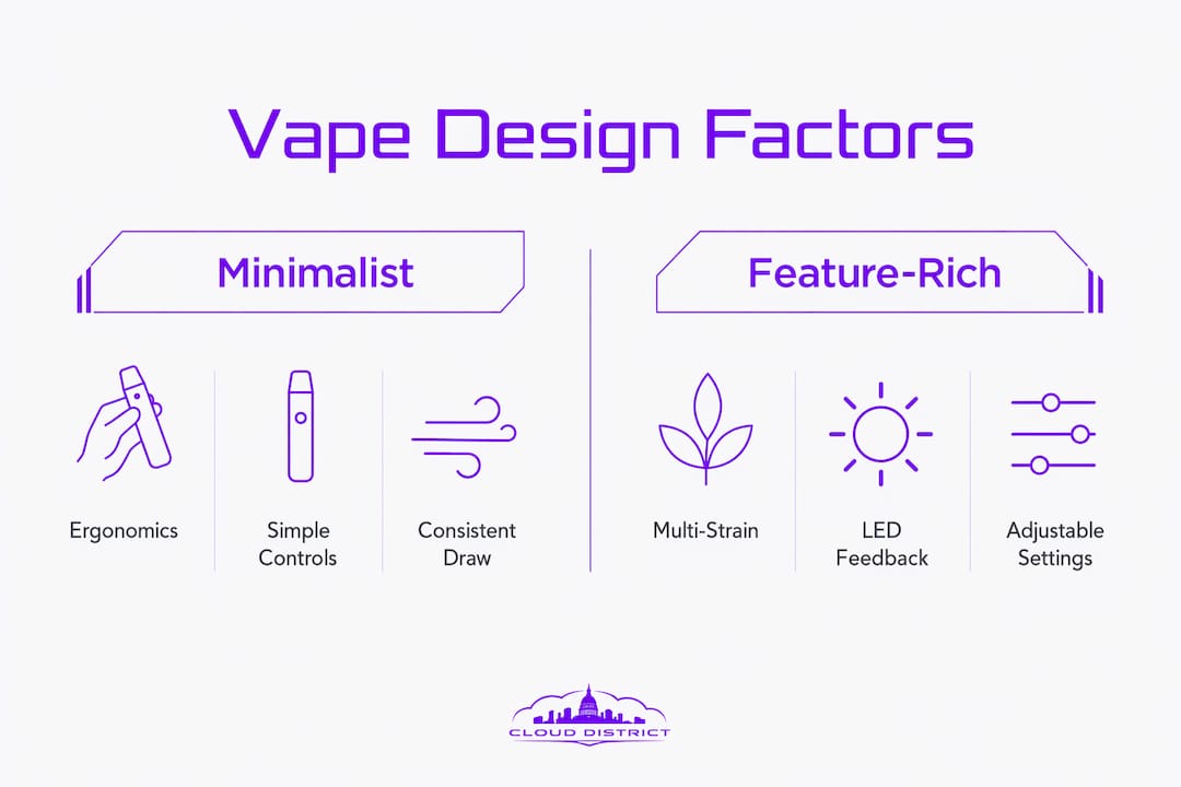
The disposable vape market in 2026 is crowded, but not all design philosophies are equal. Geek Bar has built its reputation on a specific approach: clean form, reliable function, and a wide flavor catalog that pairs with a consistent device experience. The design language across Geek Bar’s lineup is intentionally minimal. No unnecessary buttons, no complex interfaces, no visual noise. The device communicates competence through restraint.
Compare that to brands that prioritize feature density. Multi-strain chamber vapes with LED feedback and adjustable voltage settings appeal to consumers seeking variety and control. These designs serve a different user. Someone who wants to switch between strains or fine-tune their draw will value those features. Someone who wants to pull a device from their pocket and use it without thinking will find that complexity a barrier.
| Design Feature | Geek Bar Approach | Feature-Rich Alternatives |
|---|---|---|
| Activation method | Draw-activated only | Button plus draw options |
| Visual style | Minimalist, clean lines | Bold graphics, LED accents |
| Controls | None | Voltage adjustment, mode switching |
| Juice visibility | Selected models include windows | Varies by model |
| Packaging coherence | Strong brand consistency | Varies widely |
| Target user | Everyday, convenience-focused | Enthusiasts seeking customization |
The trade-off between minimalism and feature richness is a genuine design decision, not a quality gap. Geek Bar wins on accessibility and consistency. Feature-rich designs win on flexibility. Your choice between them should reflect how you actually use a vape, not which spec sheet looks more impressive. For most daily users, the simpler device wins because it removes friction from a habit that should feel effortless.
Packaging and branding coherence also separate leading brands from the rest. When the device, the box, and the flavor name all tell the same visual story, the product feels considered. That coherence builds the kind of trust that turns a first purchase into a regular one. Reviewing how to browse vape products with design criteria in mind gives you a practical framework for making that first purchase count.
Key takeaways
Design in vape selection determines usability, aesthetic fit, and long-term satisfaction more directly than any other single factor.
| Point | Details |
|---|---|
| Ergonomics drive daily usability | Draw-activated systems and balanced weight eliminate friction from every use. |
| Materials signal quality and identity | Brushed aluminum, matte finishes, and soft-touch coatings communicate premium build before the first puff. |
| Reliability is a design outcome | Leak-resistant seals and visible juice windows are deliberate engineering choices that build user confidence. |
| Minimalism outperforms complexity for most users | Brands like Geek Bar win on consistency and accessibility, not feature count. |
| Packaging coherence builds brand trust | When device and box tell the same visual story, repeat purchase rates increase. |
Why I think design deserves more credit than specs in vape selection
Most vape buyers spend their research time comparing puff counts and nicotine strengths. I understand why. Those numbers feel objective. But after spending years watching how people actually use disposable vapes, I am convinced that design is the variable that determines satisfaction more than any spec.
Here is what I have observed: a device with average flavor but excellent ergonomics gets used consistently. A device with outstanding flavor but a mouthpiece that feels wrong gets abandoned halfway through. The physical experience of holding and using a vape is constant. The flavor is only present during the draw. That ratio matters.
The shift toward vapes as lifestyle accessories is not a marketing trend. It reflects how consumers actually relate to the products they carry. When a device looks like something you chose rather than something you grabbed, it changes the experience. My advice: spend as much time evaluating how a vape looks and feels as you do reading the flavor description. The design will outlast the novelty of any single flavor.
— Justin
Find design-forward disposable vapes at Cloud District
Cloud District curates disposable vapes specifically for users who care about both form and function. The selection prioritizes brands and models where design choices are deliberate, not accidental.

The Pulse Strawberry Kiwi Thermal Edition is a strong example of design-lifestyle integration done right. The Thermal Edition finish is visually distinct, the form factor is pocket-friendly, and the flavor profile matches the premium presentation. Cloud District’s Cloudz rewards program means every purchase earns toward your next one. Browse the full catalog, order online, and pick up locally without the wait.
FAQ
What is the role of design in vape selection?
Design determines how a vape feels in hand, how reliably it performs, and how well it fits your personal style. Ergonomics, materials, and visual coherence are the three primary design factors that influence whether a device becomes a daily habit or a one-time purchase.
How does ergonomic design improve the vaping experience?
Draw-activated systems and balanced weight distribution eliminate the need to adjust grip or manage controls, making the device feel natural from the first use. Devices that fail basic ergonomic standards consistently rank lower in user satisfaction.
Why do materials and finishes matter in disposable vape design?
Premium materials like brushed aluminum and matte soft-touch coatings signal build quality and align with fashion-forward consumer preferences. The aesthetic influence on vape products extends to social perception, since a well-designed device integrates into daily life more naturally than a purely functional one.
What design features should I look for in a reliable disposable vape?
Leak-resistant seals, visible juice windows, and consistent draw resistance are the three design features most directly linked to user confidence and repeat purchases. Brands that include these elements are prioritizing the user experience over production cost reduction.
How does Geek Bar’s design philosophy differ from other disposable brands?
Geek Bar focuses on minimalist form, draw-only activation, and strong packaging coherence across its lineup. This approach prioritizes accessibility and consistency over feature richness, making it the preferred choice for everyday users who want a device that works without any setup or adjustment.